Goal
Present a ground-breaking product to the live musician marketplace, appealing to different segments of the audience in different ways and demonstrating a strong rationale for this high-end instrument.
Solution
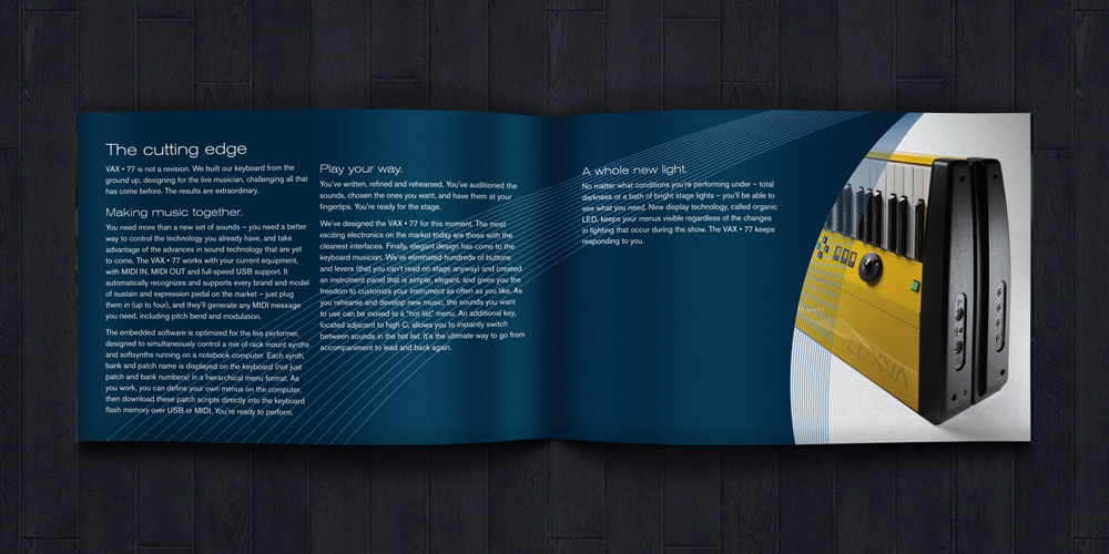
To announce the launch of a remarkable keyboard — a technological leap ahead of anything else in the market — a 24-page brochure was developed to provide customers with a detailed map of its features.
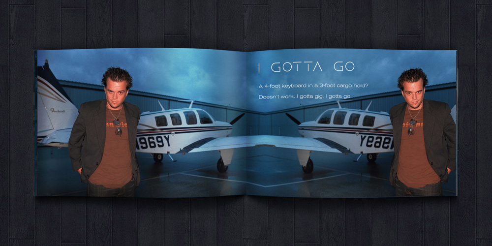
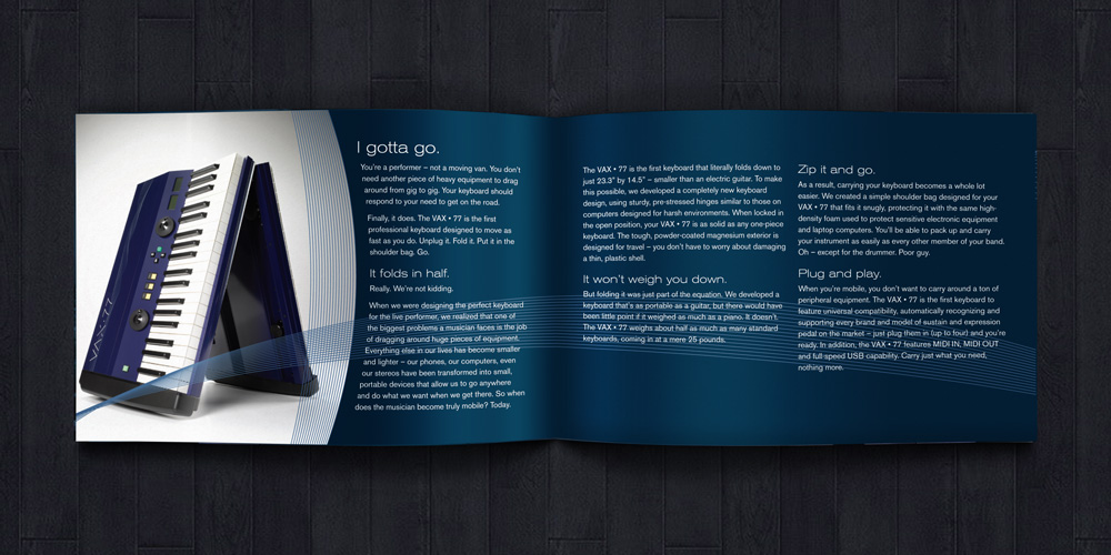
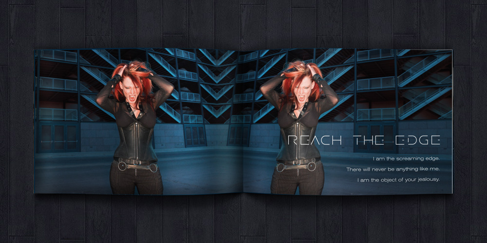
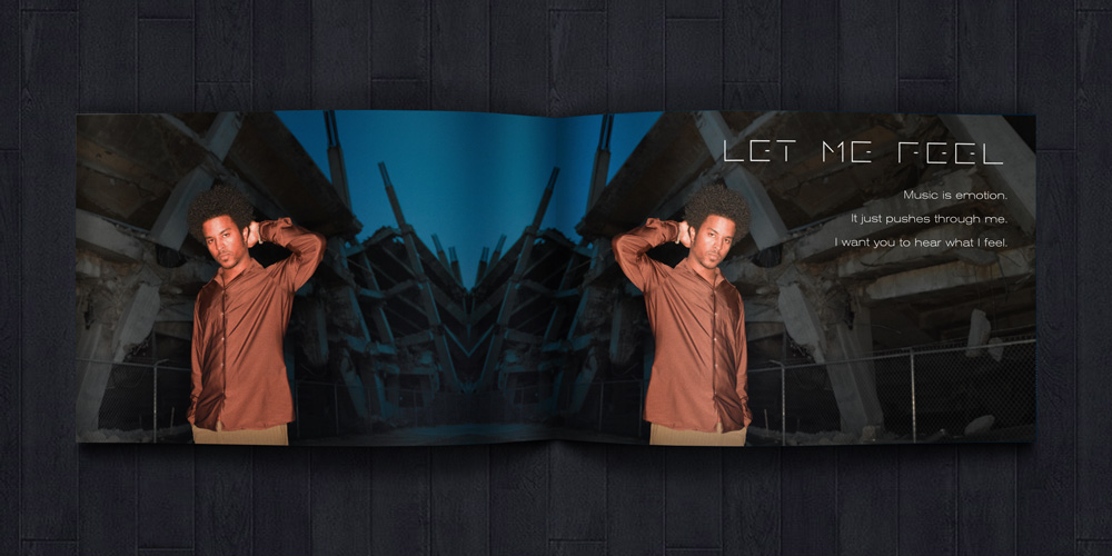
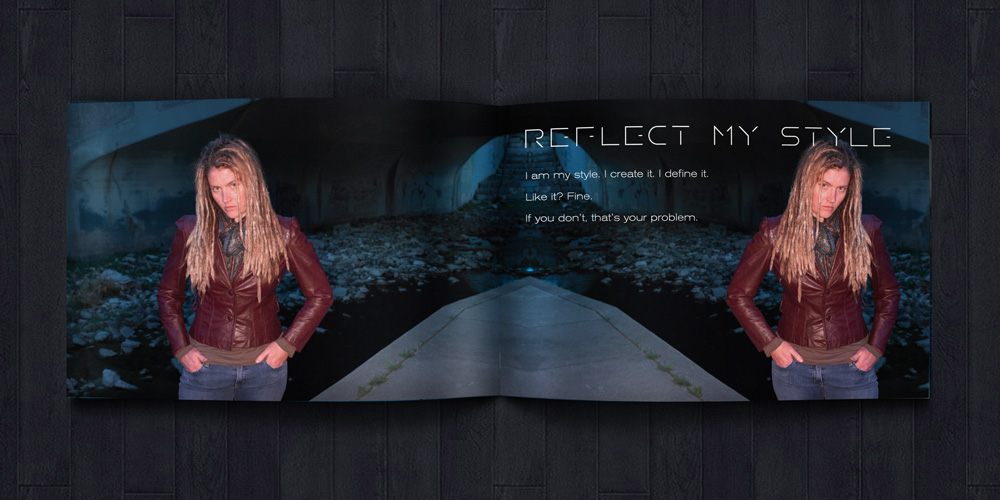
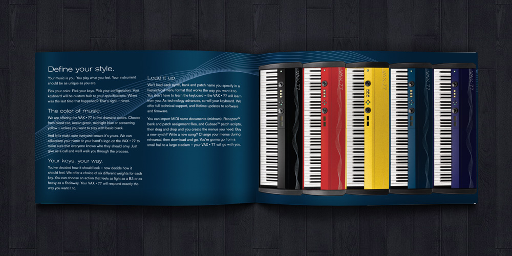
To make the large number of somewhat complex features more comprehensible, they were divided into four categories (portability, innovation, customization and playing responsiveness), and each assigned a “personality” — a musician with a particular set of needs and desires. Live musicians may perform in one or more venues each night, so portability is important for a musician who always seems to be saying “I Gotta Go.” Those who crave the newest and coolest can “Reach the Edge,” and those who want to customize their instrument will find that this keyboard offers several ways to “Reflect My Style.” For those who want the most responsive instrument available, this keyboard will “Let Me Feel” like no other.
Models were chosen and photographs taken in visually arresting locations. (All photography, including product shots, was developed by the remarkable David Grimes.) Images are presented in process color, but the outside cover was printed in a signature metallic blue ink, also used in the brand identity and other marketing materials.
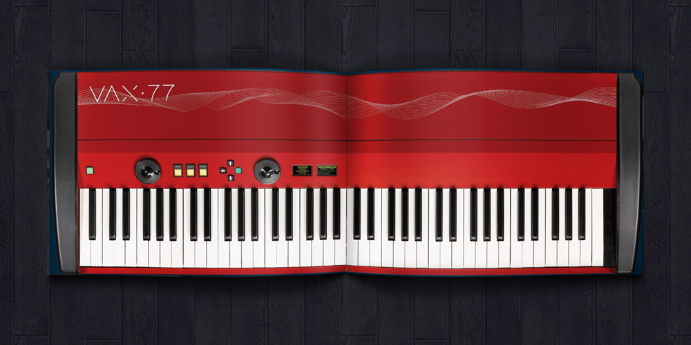
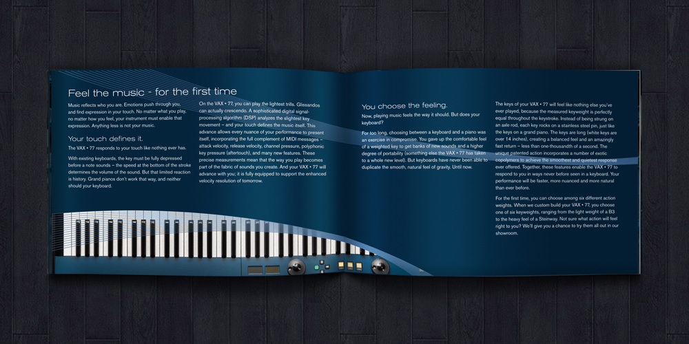
One of the most notable features of the instrument — and the most visually arresting — is its ability to fold in half. The ratio of the brochure's height to width corresponds to the ratio of the keyboard when folded. (This ratio was also used on the folded business card, which, when stood on end, looks just like the keyboard.) When opened to the center spread, the full instrument is visible. The idea of folding is also echoed in the way character photographs are reflected across the spread.
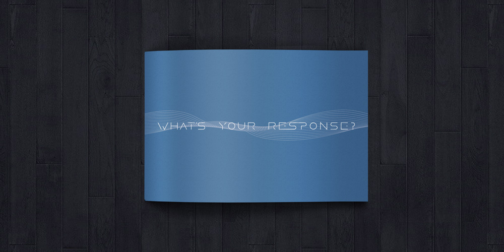
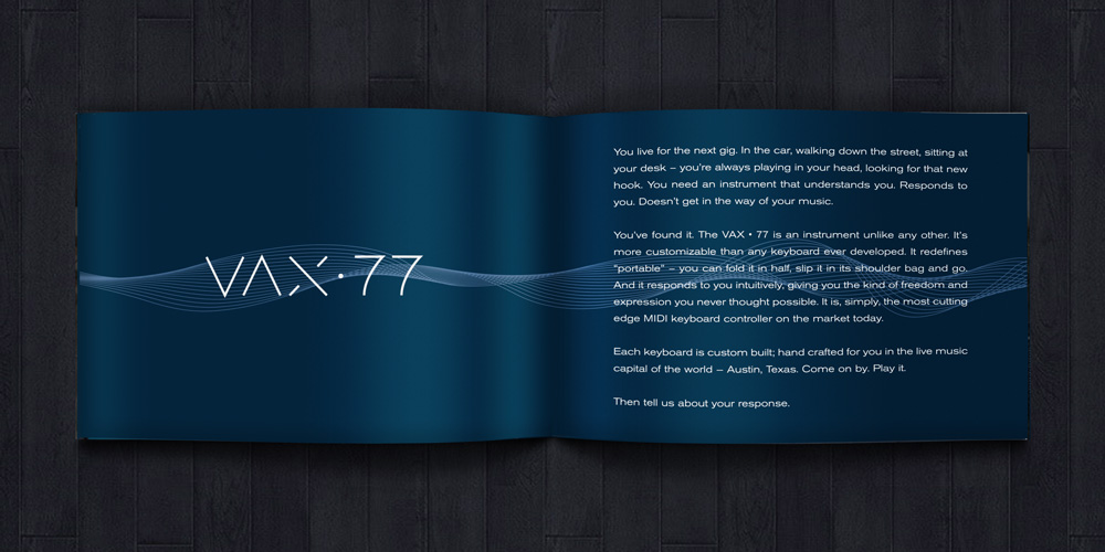
The waves used behind the logo wind through the pages and outline the product photos. The original typography created for the logo was also used for the character slogans and a question posed to musicians at trade shows like SXSW and NAMM: "What’s your response?"