Goal
Produce a single brochure that describes three very different service offerings for two different audiences, clearly delineating between the dental audience and the patient practice. Explain the necessity for proper occlusion while maintaining a clear focus on aesthetic considerations, demonstrating how one does not preclude the other.
Solution
Occlusion – the way our teeth come together when we bite – is the primary focus of this dental organization, offering professional training for dentists, a patented appliance available from the in-house laboratory, and a public practice specializing in people who require complex, whole-mouth transformations. This focus is captured in the slogan that also serves as the company's URL, "The Right Fit." This idea is reflected in the company logo — three shapes that fit together perfectly.
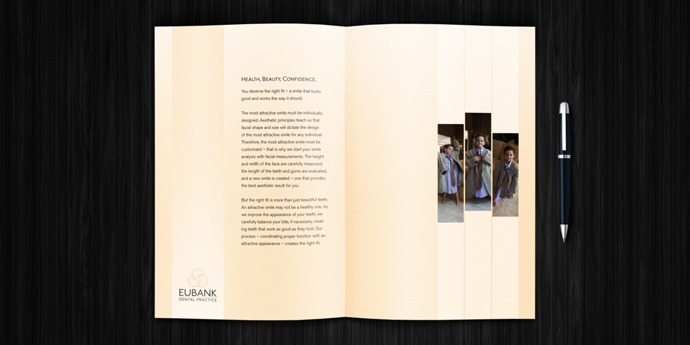
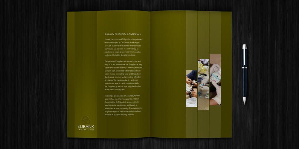
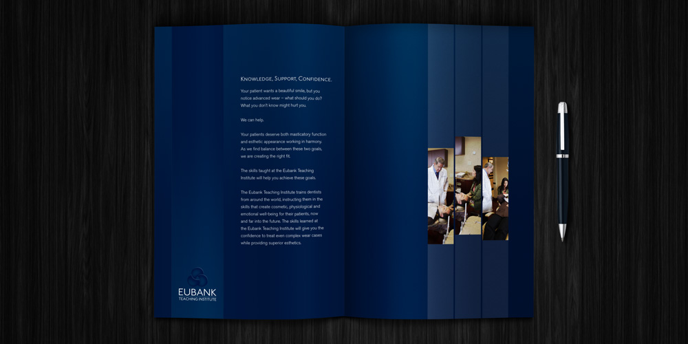
This brochure briefly describes each aspect of the organization and demonstrates how each aligns with the overall philosophy that guides them all. Three related photos recall the three interconnected shapes in the logo, each photo adding to the story told by the other two.
Each part of the practice was assigned a color. Blue and olive are used in materials directed at dentists, while a light flesh tone denotes the patient practice. Rich black was used in materials developed to promote the entire organization. Each two-page spread incorporates the appropriate background color for that department.