Goal
Create a message and brand identity for each of three service areas – a laboratory, teaching institute and patient practice – that share a common focus on dental occlusion.
Solution
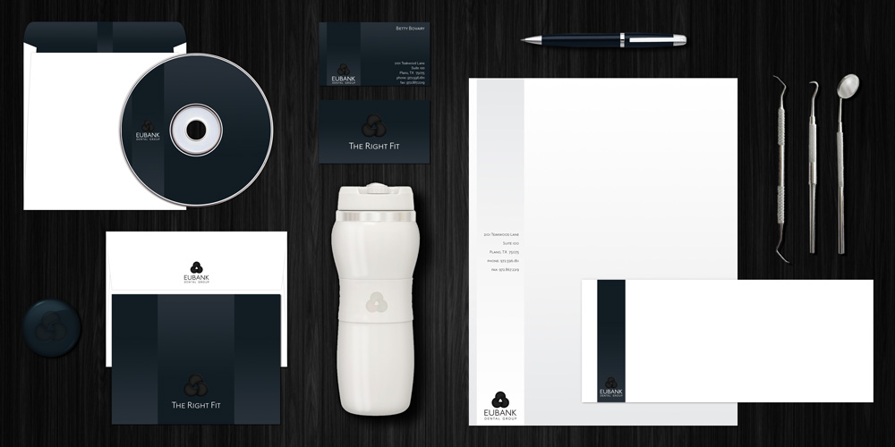
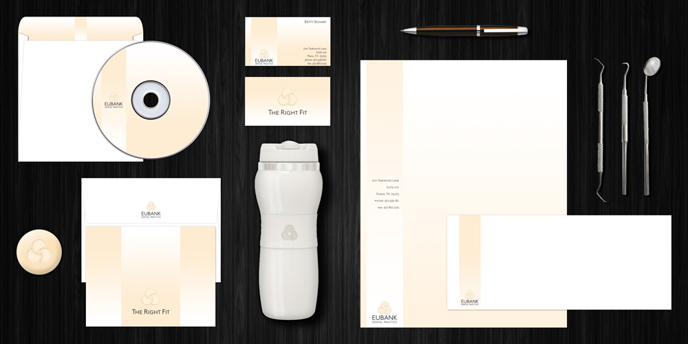
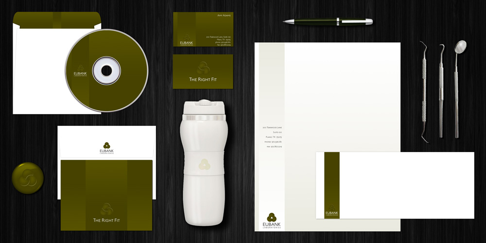
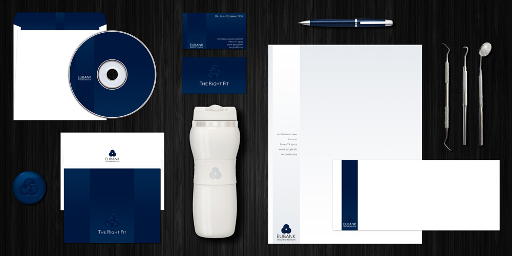
Proprioception is the sense that tells us how much force to use when we pick up a feather or a bowling ball. It also lets us know how hard to bite when we bring our teeth together. Occlusion describes how well the surfaces of our teeth align when we bite. When the right amount of proprioception is used on surfaces with good occlusion, you have “The Right Fit,” and an appropriate slogan (and URL) for this client.
Used as a blanket message across all three primary service areas, it describes the philosophy on which all the services depend. The Institute offers classes for other dentists from a well-known, well-respected leader in this field. The Laboratory produces a custom-made, patented appliance that dentists may prescribe for their own patients. The Practice provides services to patients who often need extensive reconstruction and require comprehensive care. Dark blue and olive colors are used in materials for the audience of dental professionals, and a light flesh tone is used for the patient practice. Rich black is used for materials that promote the entire business.
Each department received its own set of business papers, but required different marketing and promotional materials. One single large brochure catalogs each of the different services and describes the overarching philosophy – how the practice, classes and appliances create the right fit for patients and other dentists.