


Goal
Develop a sophisticated logo that visually describes the "accurate path" — a precisely crafted transistor measuring just a few nanometers.
Solution
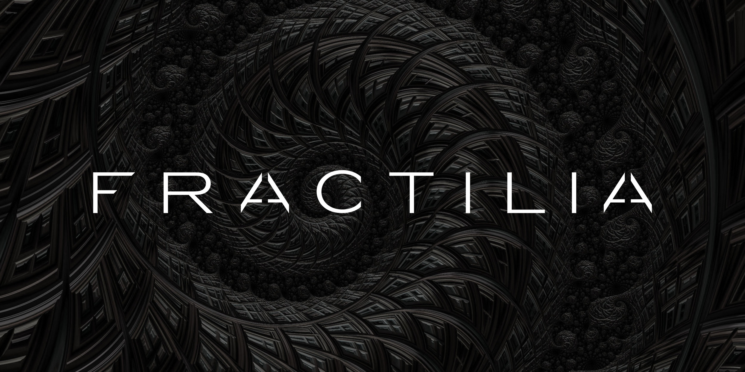
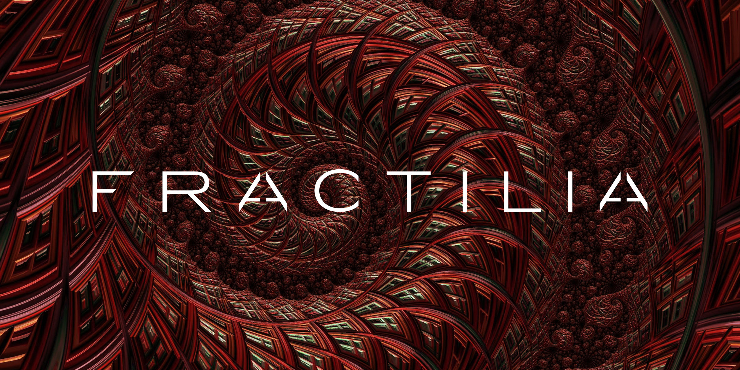
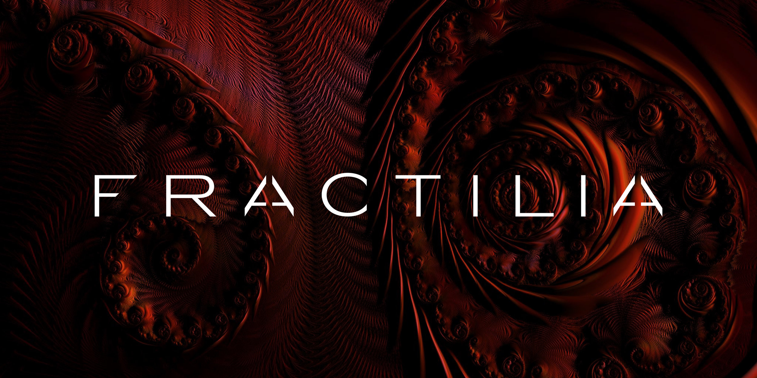
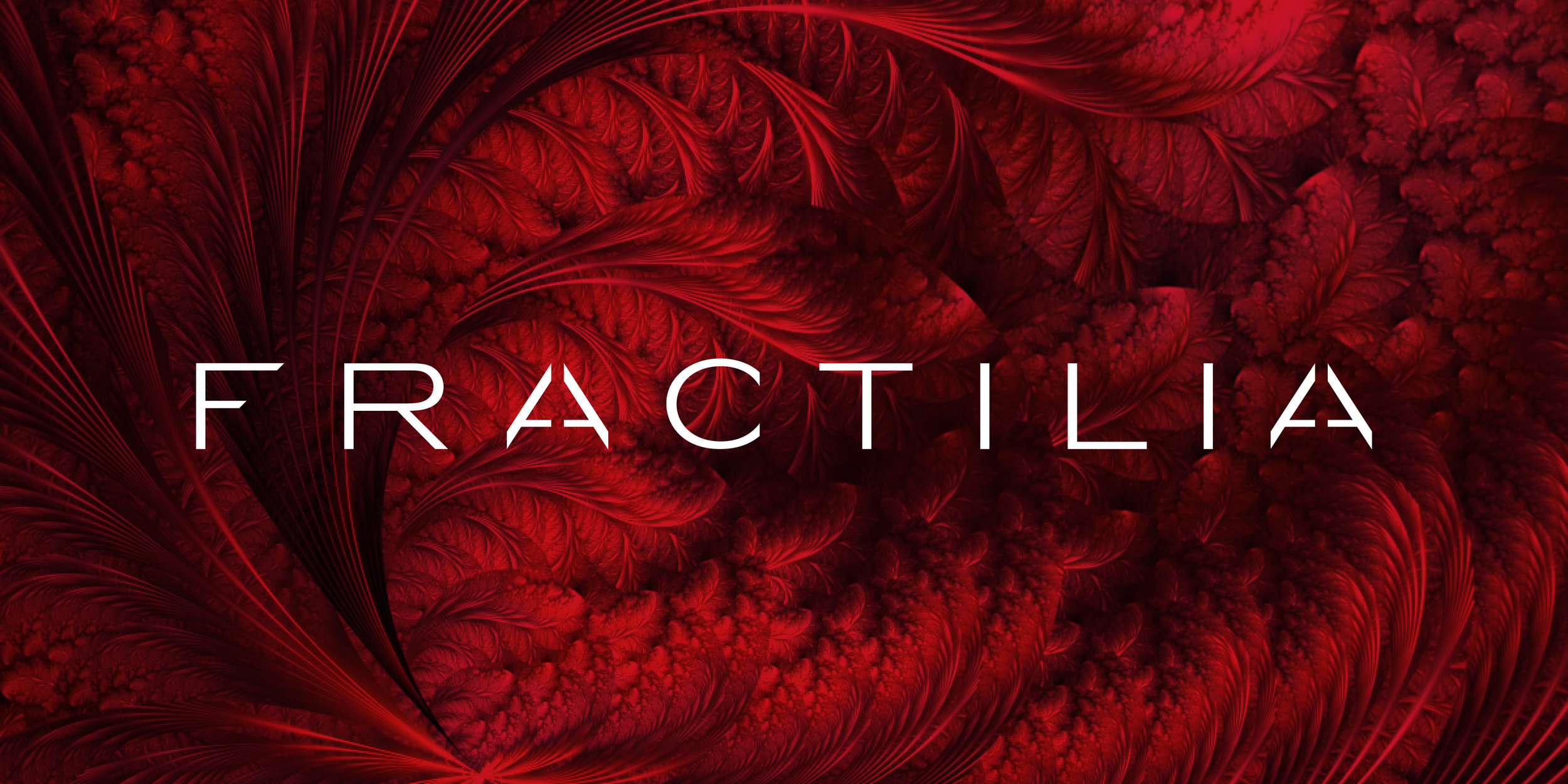
The logo incorporates a strong typeface formed from thick, angular lines, a reference to the features in SEM images. A single path bisects the "A" and creates 45-degree angles on the "F" to reinforce the allusion to the structures analyzed by the product.
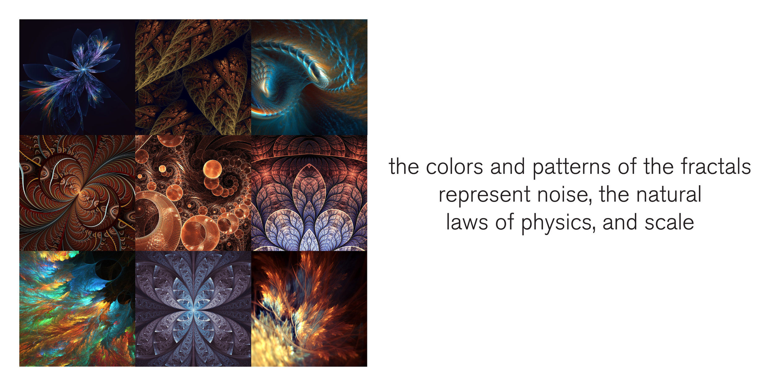
Two types of background elements visually describe the customer experience. The colors and patterns of fractals represent noise, the natural laws of physics, and the almost unimaginable scale of the structures analyzed. The paths represent the process of creating order from complex systems, smoothness, man-made design, choices and the analysis required to increase path accuracy. The contrast between the spare, smooth lines in white space and images of rich, complex fractal forms in bold colors visually represents the application of analysis and algorithms to the complex, multi-dimensional problems posed by physics and the natural world.
The colors are bold: deliberate and authoritative. Deep blues and reds and grays connote a serious approach to technology. Dark grays reference the SEM images analyzed by the product.