Goal
Revise an existing identity to visually represent an organization's three primary service areas, all focused on the development and implementation of accessible technology.
Solution
Public accommodations for people with disabilities, like wheelchair ramps and captions on television programs, provide universal convenience: anyone can pull luggage up a ramp or read captions while exercising at the gym thanks to these common modifications. In the same way, technological accessibility improves usability for all of us. One study found that almost 70% of all users take advantage of the accessible modifications incorporated into websites, computer software and mobile applications.
For the last 15 years, this organization has helped companies integrate accessibility features into their web sites, intranets and other technologies. It has grown from a small, event-centered organization into a recognized leader in the field, adding consulting services and a nationally-recognized annual training conference to its offerings. The initial identity needed an update to reflect these changes, but a decade of outreach and recognition required retaining much of the existing brand.
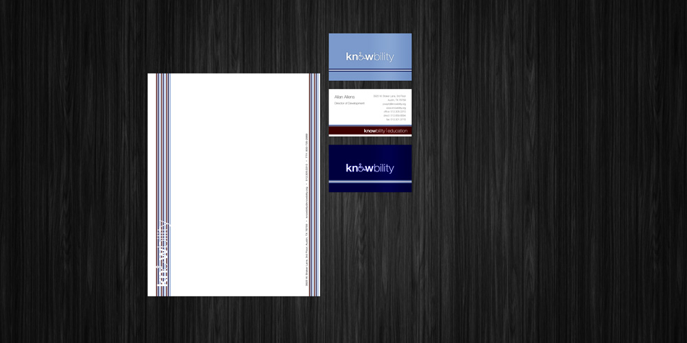
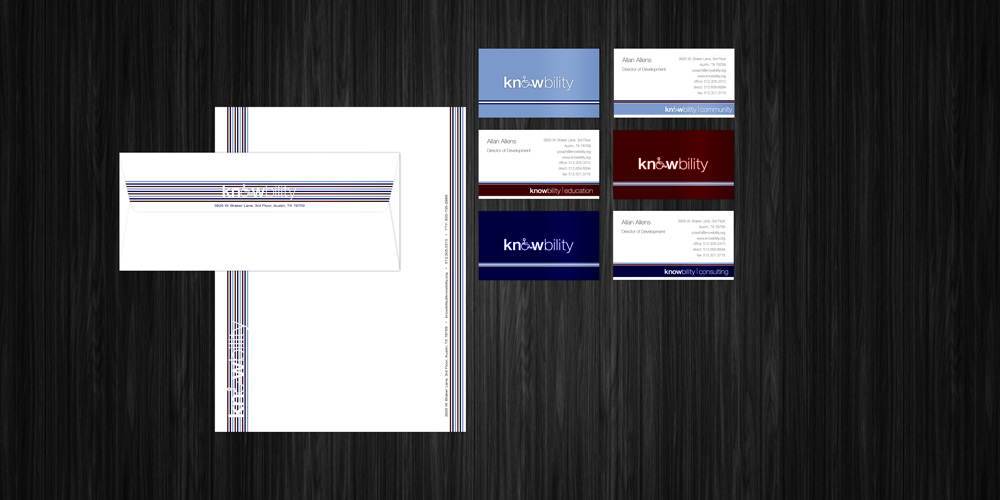
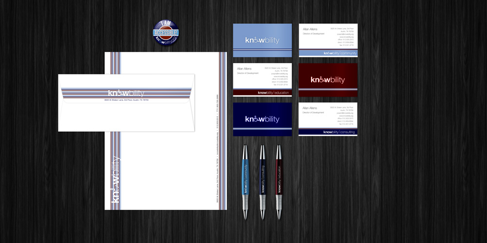
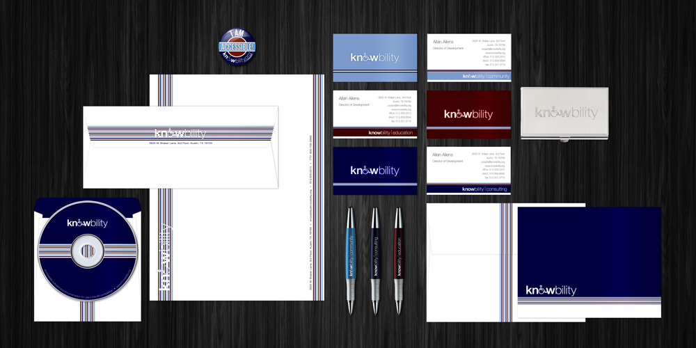
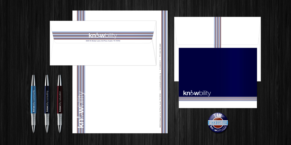
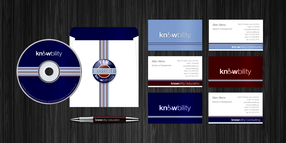
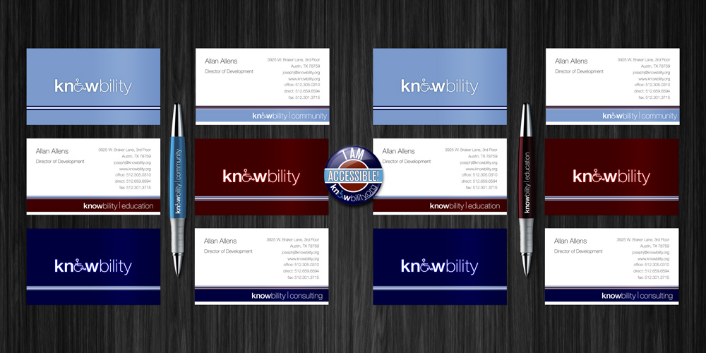
The company name is a portmanteau of "knowledge" and "ability," and the logo combines these words using two weights of the same typeface. The original logo included a figure in a wheelchair – the universal symbol for disability – but that symbol was too referential for an organization that advocates for technological modifications benefiting almost everyone. The wheelchair symbol was replaced by the letter "o" in permutations developed for the organization's consulting and educational services, and retained in applications used for community outreach. Department designations, separated by a thin line, were added to the logo and each department was assigned a color to distinguish it visually.
The original colors – a bright, spring green and sky blue – did not provide enough contrast to adhere to basic accessibility principles. The sky blue was retained, and two new colors were added. The dark blue and dark red come from the web-safe color palette, each just one click from black on the red or blue continuum (#330000 and #000033).
The colors chosen for each of this organization's primary departments are used in every part of the brand identity. In materials used by the entire organization, white is the primary color, and the department colors are used in alternating stripes, creating an image of unity: three offerings (consulting, education and community investment) working together to advance a single goal. Materials used by a single department primarily use the color of that department with accents of the other colors. In other materials, the stripes glow and undulate, referencing the virtual world where this work takes place and the unobserved yet vital way that accessibility techniques blend seamlessly into the background of our lives, energizing and connecting communities.